Notes from the new OS releases
iOS18 + MacOS15 + WatchOS11
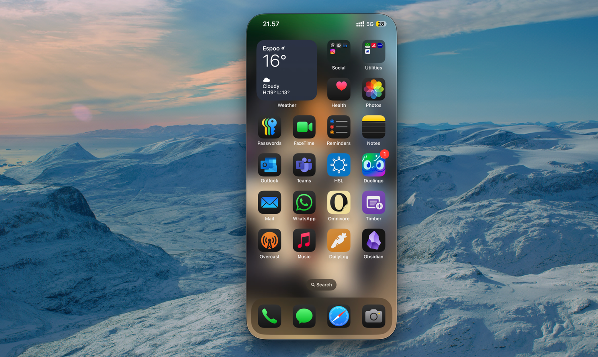
Apple released the new versions of iOS, iPadOS, WatchOS and MacOS (surprise!) on Monday 20:00 PM EEST. I had set an alarm to be reminded of the same. Yes, I was that excited about it. Of course, not so much excited as to install the beta software. I had done that once, and because you can not go back to the normal version after installing the beta OS on the watch, I did not try it again.
This is not a review. This is just a list of things I noticed, or found useful or just something new that I came across in my very limited time with these OSes.
Revamped Control Center
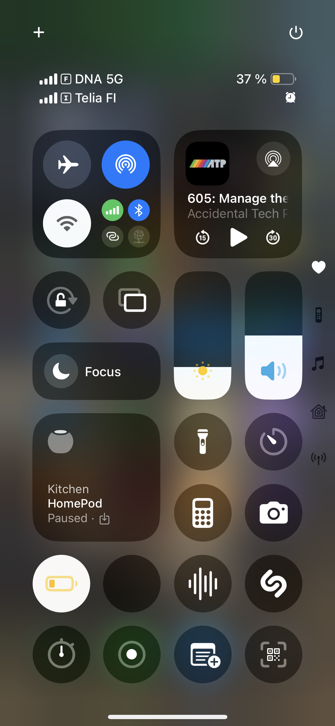
The first thing I noticed, or tried as soon as the upgrade was done was the revamped Control Center. It has multiple screens (tabs?) now. With the Favourites view being what we had earlier. And new tabs for home, network, music, etc.
Home Screen Customisation
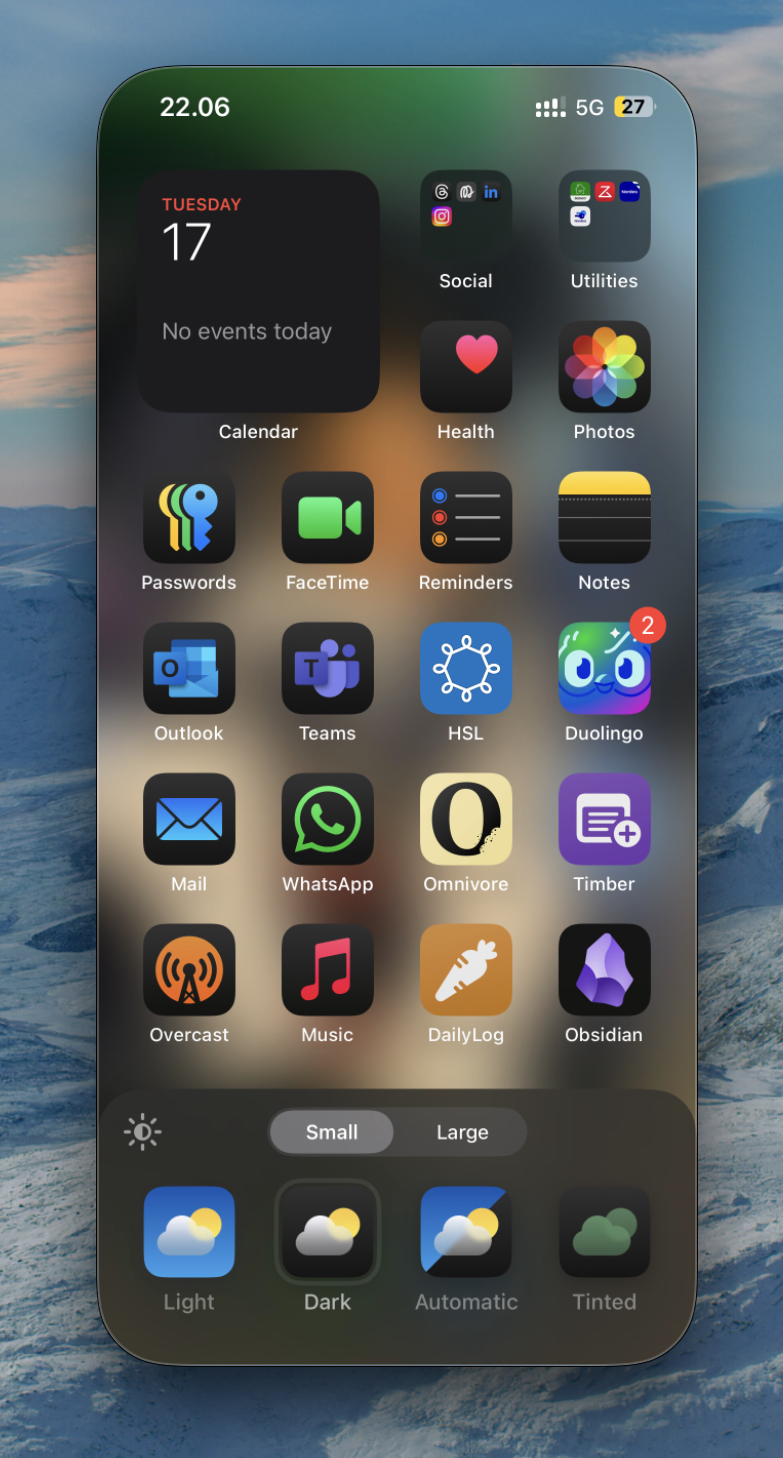
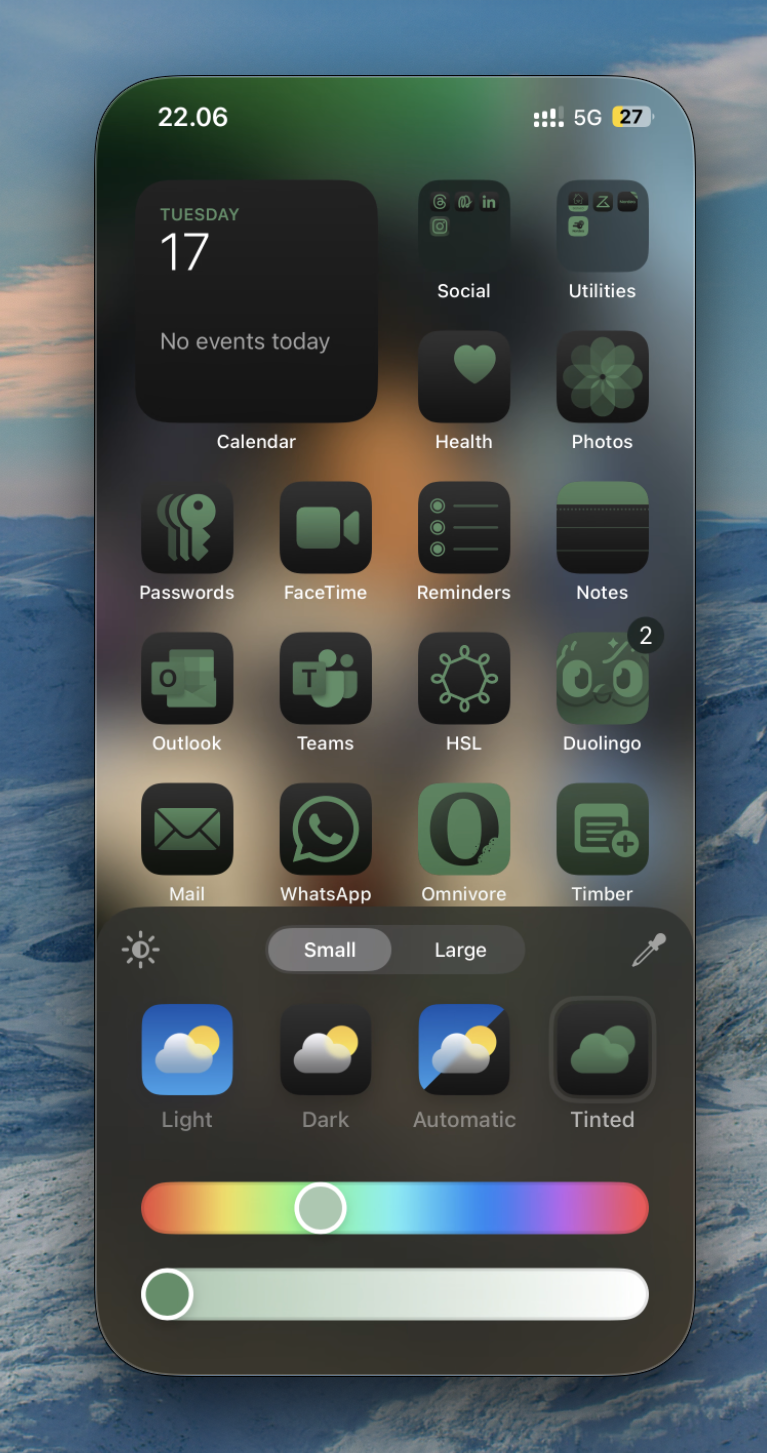
The second thing I did was go into jiggle mode, and check out the app icon tinting. You have a few options here: light, dark, auto or custom tint. I keep my phone on dark mode all the time, so I chose dark. Of course, I also looked up what others were doing with this, and I did not find anything that spoke to me.
The other thing one can do know is leave spaces on the screen. Put icons in a specific place. I tried that. But I am a single home screen person. And I do not have a wallpaper on my home screen. So I personally do not find utility in this at present.
But hey, that might change in the future as well.
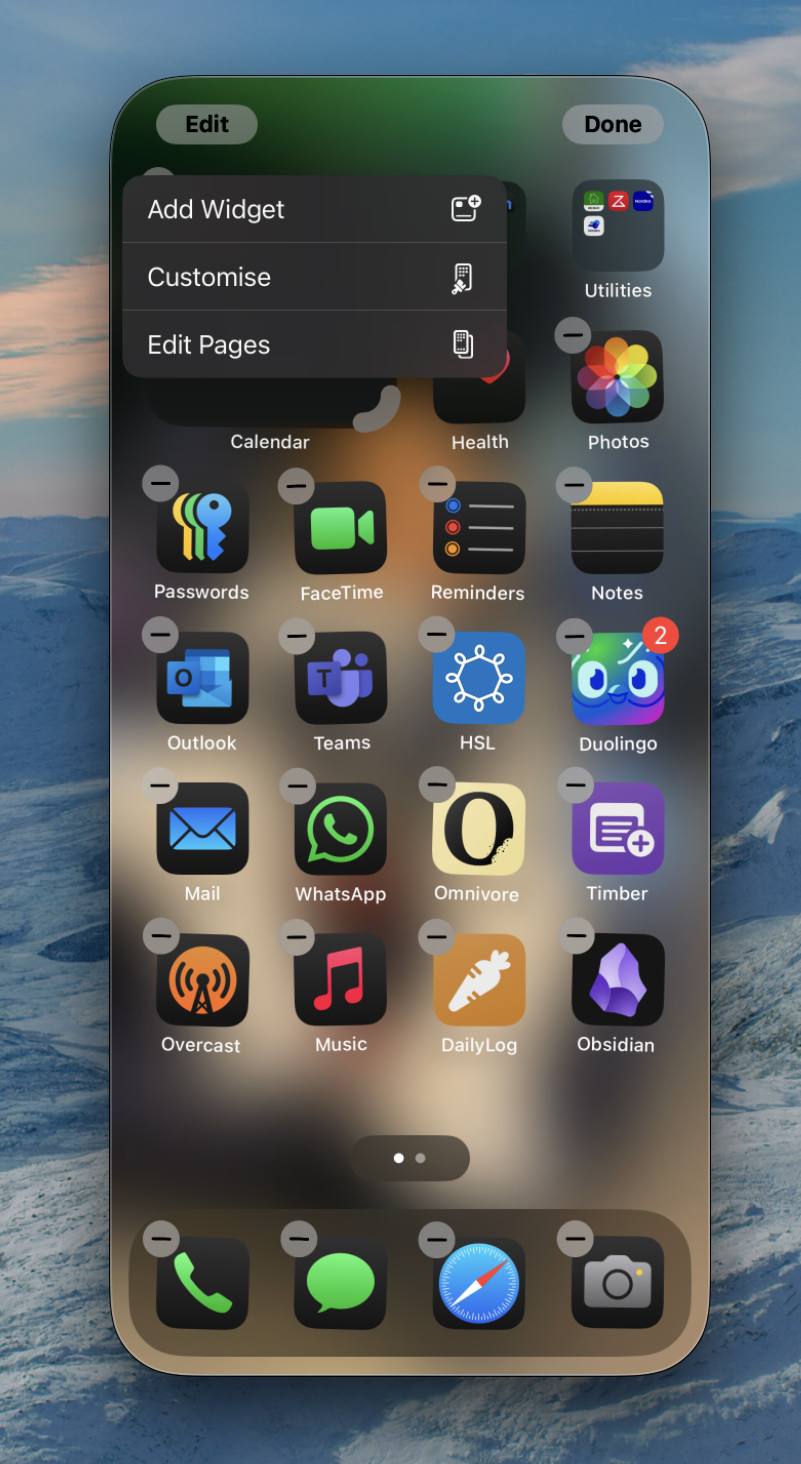
Customisation!
Apple Photos redesign
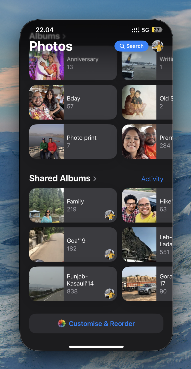
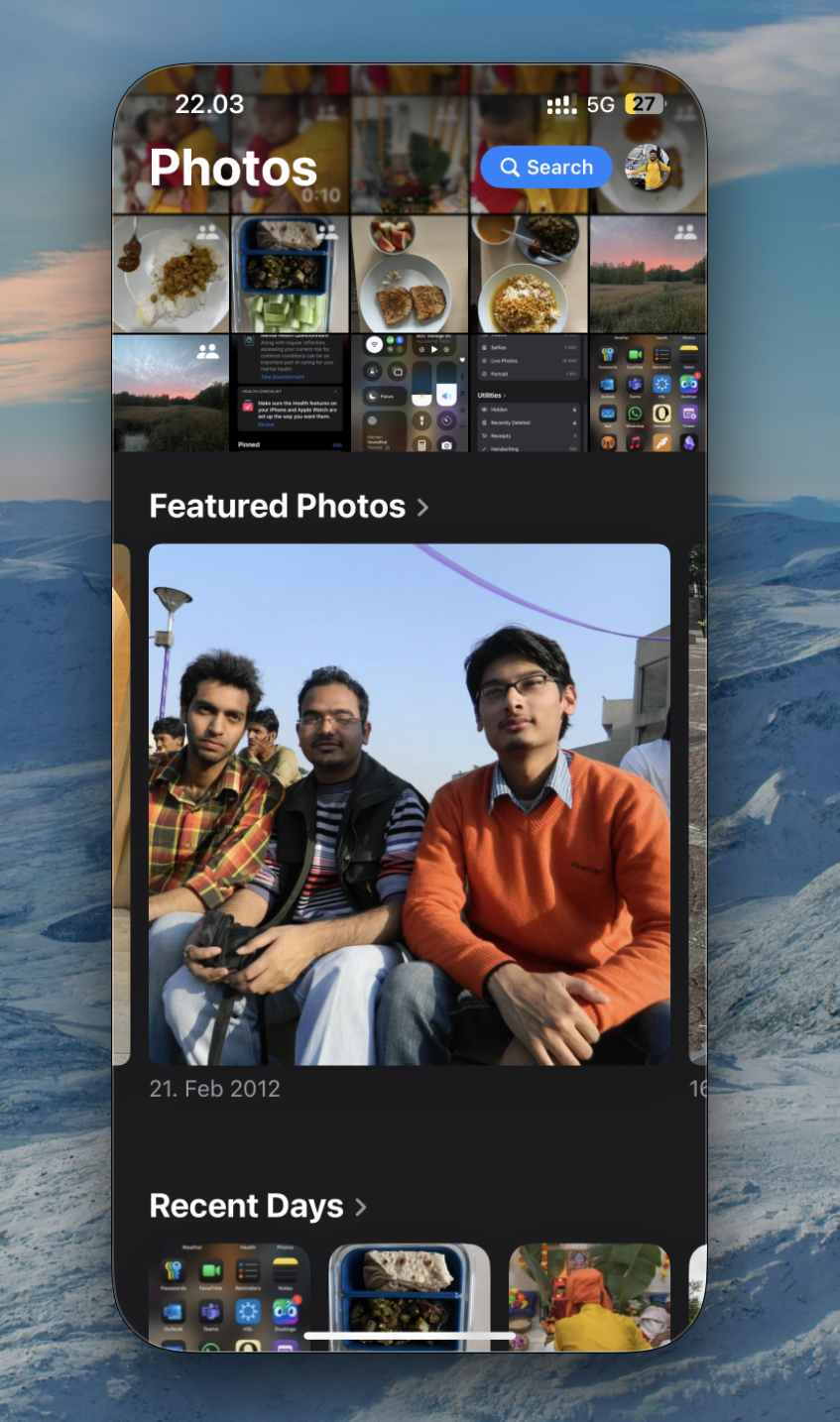
Apple Photos now has a single UI for Photos which combines the library and other tabs which hid things like featured photos, or memories, or people albums. Collections is new. Where using the same ML algorithms which helped surface Memories, each collection gets an autoplay video. Recently Saved is a particularly useful one.
I did not like it at first when I opened it. I know the reasoning for why they made the changes. Most people were not using the great recall features. So, this will help with discoverability. But I was not one of those people. I was using these features. Almost on a daily basis. Heck I had that Featured Photos widget on my home screen!
It was jarring to say the least.
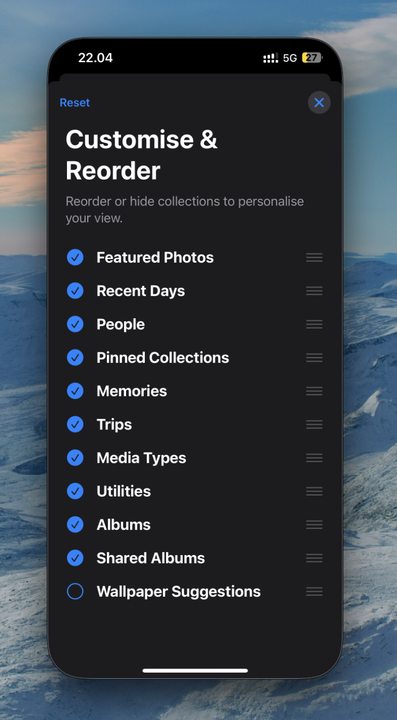
One thing that helped was reordering and customising the collections that the Photos app showed. You basically scroll down to the bottom and there's a customise & reorder button. Click on it and you can remove options that you don't want to show below your library. Drag the ones you want to show earlier. I moved Featured Photos to the top. And removed Wallpaper Suggestions. Just moving the Featured Photos to the top of the stack improved the view for me.
Syncing has moved to your profile icon (button?) on the top right. The UI shows the progress as a small filling circle as it syncs your photos. Which is cool!
Mental Health Questionnaire
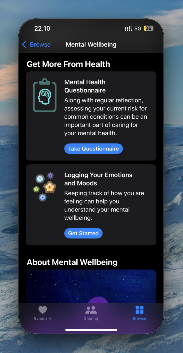
Apple Health had a prompt for Mental Health Questionnaire. This was a list of 16 questions about how you're feeling. The default frequency for both (Depression and Anxiety risk) at least for me was 6 months. That might be a dynamic field though.
Health Features
Vitals
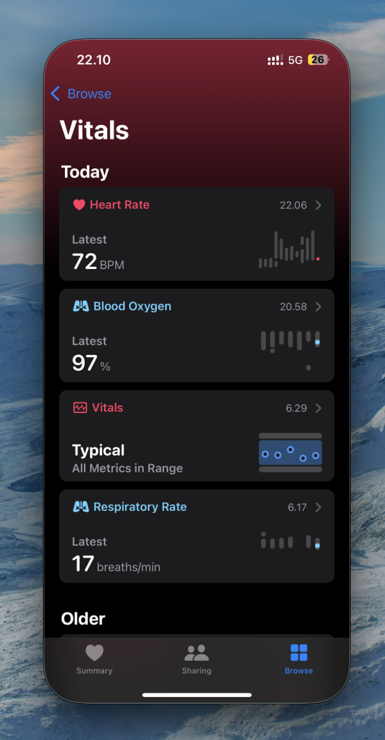
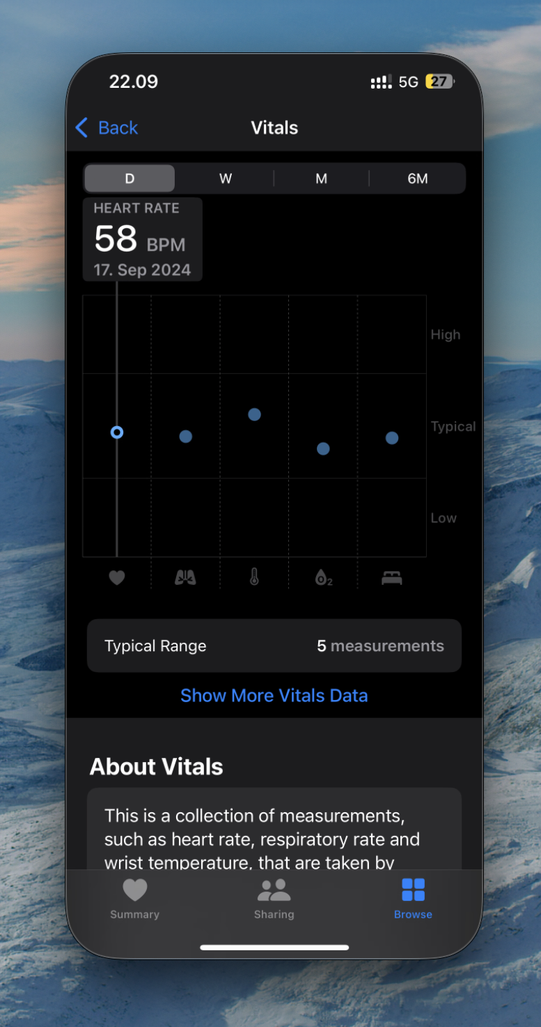
Apple Health/Watch got Vitals. I got the prompt for this after upgrading to WatchOS 11. This is a set of measurements taken by Apple Watch overnight. Things like heart rate, breaths/min, temperature, etc. It takes a week for a baseline to be ready. So check back in a week I guess?
iPhone Mirroring on Mac
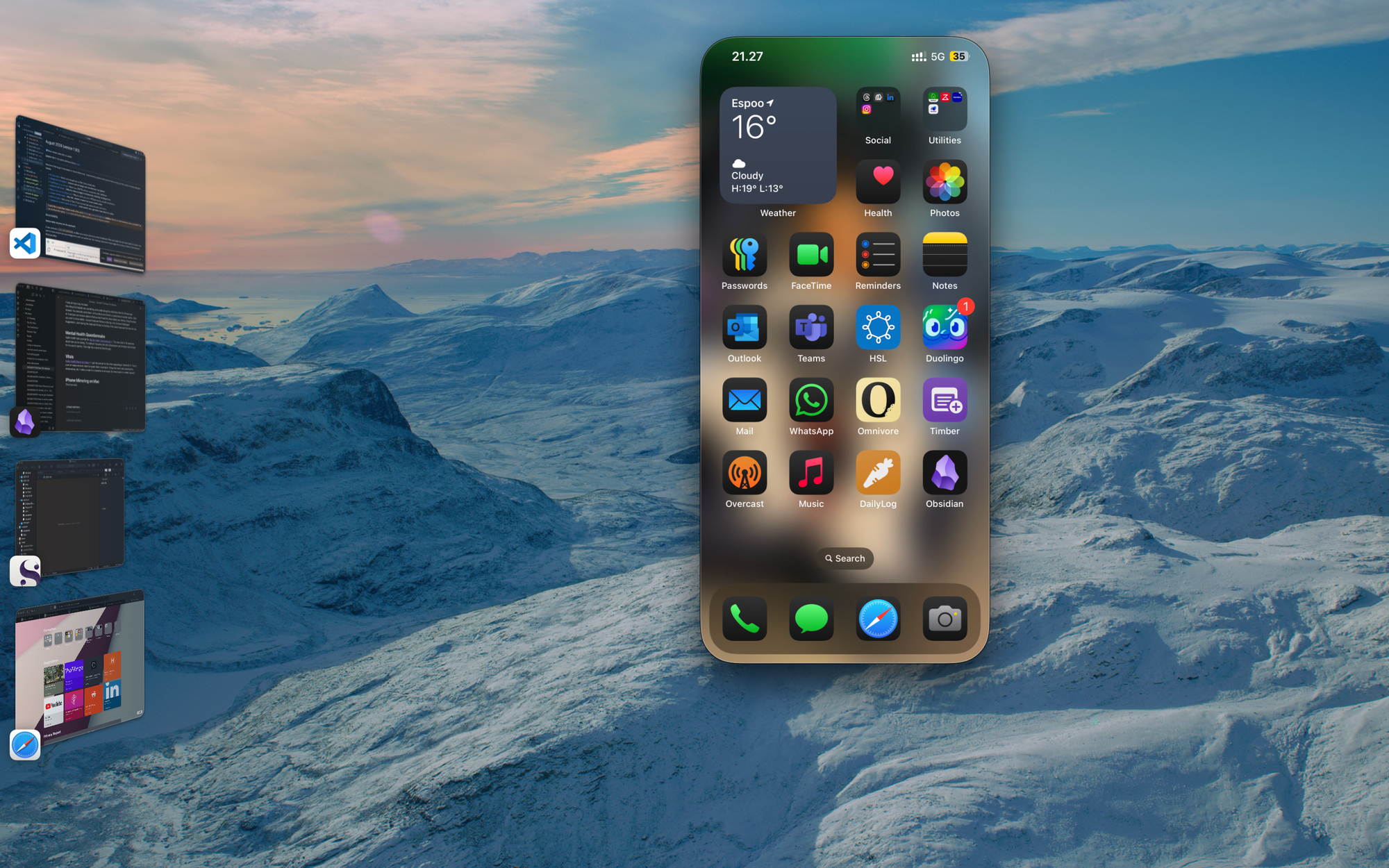
This is so cool! You can basically control your phone from the Mac. You can arrange your home screen from the Mac! Which is way better than doing it from the phone because the apps still zip around like crazy! You can open any app! This will be so great when you are on the Mac and there's something you need to check on the phone. Maybe an authenticator code or some other SMS thing.
Closing thoughts
Apple Intelligence looms like a shadow on this release. Apple Intelligence will come to a really small subset of users. And in any case, I am not sure how useful most of these features will be. But that is a discussion for a different time. The thing that I noticed after the upgrade was unless I knew what to look for, it is very difficult to know just by looking that anything has changed. Which is a mark of a mature platform. And these are all mature platforms. They should not change from one release to the next. You do not want the user to relearn how they use their phones.
The Photos app redesign for sure will be the most jarring change for most people. I am still not sure if I like it. But I think I will. It is more flow-y now, instead of how boxy it used to be. And I think that's a good thing.


