Out now!
A Year of Mornings
A collection of fifty love poems that follows a young heart as it finds love, finds the strength to be in love and finally, finds the strength to let go.
Nab your copy:

I am a platform engineer and a writer based in Finland.
I am the author of A Year of Mornings, a collection of poems for young adults.
NordLetter
I send out a newsletter once a week about living in Finland + five interesting things I've found on the open web.
Featured
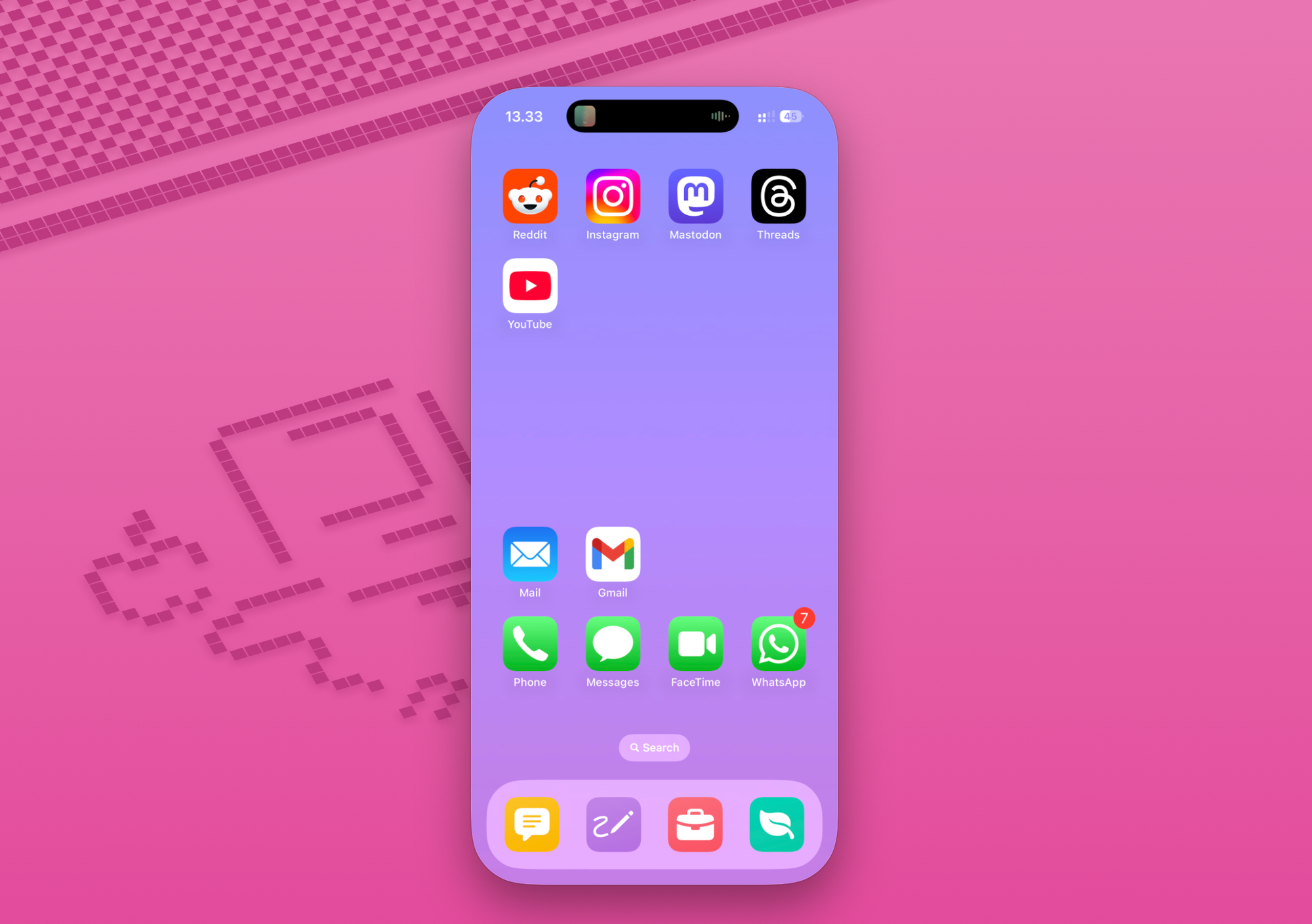
Re-Designing My Home Screen and the Way I Use My Phone
Focus modes + Shortcuts magic
Stream
Leaked images show Microsoft’s new Xbox Cloud Gaming controller by Tom Warren
But this Xbox Cloud Gaming controller is separate and designed to compliment Microsoft’s expanded cloud gaming efforts with Game Pass. It will connect directly to Xbox Cloud Gaming servers to reduce latency, much like how Google’s Stadia controllers used to work.
I am interested to see how this all works out.
South Korea Floats 'Citizen Dividend' Using AI Profits - Slashdot
Presidential policy chief Kim Yong-beom said in a Facebook post that a portion of the profits and tax revenue derived from the artificial intelligence boom "should be structurally returned to all citizens." That is because, Mr Kim argued, the economic gains from AI are based at least partly on industrial infrastructure built by the country over five decades.
Perhaps one way to do this. Perhaps the easiest way.
Geography is four-dimensional | Derek Sivers by
Forty years ago, a family moved from India to Canada, and raised their children with “Indian values”. When those children visited India last year, the locals laughed at their outdated beliefs. What their family had said were facts were just a perspective from 1980.
I have had this feeling many times in the past. Our memories of places seem stuck in time. Some things change, some don’t.
Like super-fast delivery services exploded while I was in Finland. It was a surprise to know, when I first did it, that I could place an order and it will be at home in ~ 10 mins.
Time is the fourth dimension.
And then you have the tourist. Bright-eyed, eager, and fresh off a rewatch of their favorite Rick Steves episodes, the tourist is the most naive person to ever arrive in the city. The tourist has not spent decades fitting themselves into a jaded but comfortable box named Life In The City. The tourist, more than any local, can really do whatever they want.
Thariq on X: "Using Claude Code: The Unreasonable Effectiveness of HTML" / X by
HTML can allow you to interact with the document, for example you might want to ask it to add sliders or knobs to adjust a design or allow you to tweak different options in the algorithm to see what happens. You can also ask it to let you copy these changes into a prompt to paste back into Claude Code.
Thought provoking piece.
I have been defaulting to asking Claude to generate outputs and artefacts as HTML only.
Over time though, I noticed it using better formats, for example when I asked it to teach me something. It created a multi-tab html artefact, I could use. I saw its value then.
I also saw its value today, when I wanted to build a dashboard in tableau and wanted instructions on how to do that. It is good at generating htmls with buttons I could click on, to mark something as done, with svg wireframes to give me an idea of how the thing should look like.
Markdown has value though. Obsidian runs on Markdown and it has great value. But as people has been wondering about chat interfaces and how that is the CLI of computing, I wonder if this is the next evolution of it.
I do remember Google announcing something similar though - that Gemini was very good at building web apps and whenever you asked it something it would create a new page with that information..
But this is a user hack, a prompt thing and so something you can control. And hence better in my opinion.
I will be trying this more often.


